Thanks, Kate, for the great post on McCandless’s animated visualization. (Information is Beautiful is also the title of a truly terrific book of visualizations that I highly recommend checking out.)
The use of the word “problem” set me thinking. If there is a problem, what is it and where is it? One could argue, I think, that the sheer selection of certain numbers to work with posits an argument of sorts (opting for these categories instead of others suggests their relative importance, in other words). There’s even a bit of narrative quality to the piece, with the credit crisis debt trumping all others and set in the sequence such that the music dramatically picks up as it’s dropped. So perhaps the piece does have an argument; it’s just not clear-cut.
Which suggests to me that if there is a problem, it does not lay with the piece–but with us. Our problem is that we are asked to interpret the information and construct an argument of what it’s arguing. Our interpretation–what does it mean?–is then automatically pitted against other interpretations, which is to say, argument against other arguments.
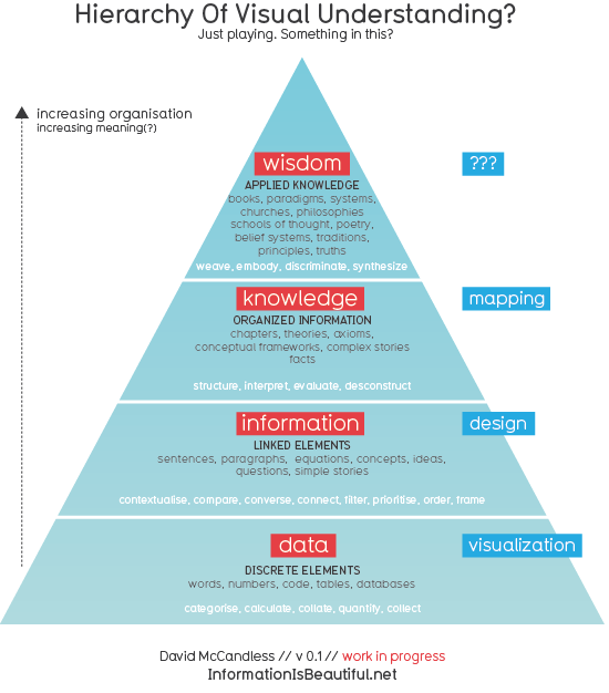
McCandless actually has another visualization that provokes a similar line of questioning using different terms:
Using this vocabulary, the problem we’re presented with is transforming information (the simple story of linked debt-centric elements) to knowledge. This transforming act is no doubt affected by the natural trajectory towards wisdom (us rhetoricians may think phronesis would fit better here than plain old “wisdom”), which makes the entire interpretative process infinitely more complex–and interesting.
I’d be curious to hear what you think of this chart: its basic assumptions, what might get added, how it might be altered for teaching, etc. And I’m sure McCandless would, too. In his posting of this he actually links to a rhetoric blog run by Catherine Schuler, Assistant Professor of English and Professional Writing at East Stroudsburg University, so he’s demonstrated that he’s linked to our community in some fashion.
On a final note, I was intrigued by McCandless’s mention with “Debtris” that we should expect more “motion infographics” in 2011. Interest in infographics has exploded in the past several years (even though it’s been around for a long time), but the move towards animation and video is taking new routes recently. Check out this fascinating video by the dynamic Hans Rosling, for example:

