I’m guessing all of your eyes and minds are as exhausted as mine after a day of work, which, for many of us, contains a fair amount of web wanderings. (I’m prepping a course in digital media composition, so I get/have to spend a lot of time looking for and at teachable texts and sites. Any recommendations are always welcome!) It’s not just the wretched pop-ups or those expanding ads, but all the colors, links, sidebars, and navigation tools that distract the reader from the actual text under examination. My burning eyes and burnt brain have seemed like an inevitable side-effect, a necessary evil. Until now!
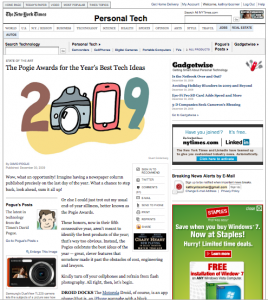
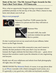
David Pogue’s “Pogie Awards for the Year’s Best Tech Ideas” in today’s New York Times introduced me to a groovy new (and, like all the best tools, free!) button for your web browser that promises, as Pogue says, to be a “real life-changer.” Readability clears all of the pesky distractions away from the central text under consideration, leaving only a simple, clean, and customizable view. Check out the difference between Pogue’s original article and the Readability version:
How cool is that?!?! My new year’s gift to you: some breathing room for your eyes.


Actually, I ran across an article not too long about about the readability of news sites from drawar.com: “Old News: News Sites.” The article advocates for a more print-like design philosophy (for the main page at least), which avoids the clutter of too much content. You should check out the article.