I just opened a letter from one of my credit card companies and was immediately put on guard: something just seemed different.
Unlike many of my friends (but perhaps not those who consider themselves professional rhetoricians) I’m in the habit of actually reading credit card policy updates and other fine-print heavy documents, like contracts, nutritional notes–you know–“enlarged to show texture”-type stuff. It certainly isn’t born out of some rigid sense of responsibility; it’s much more of a perverse delight in how much communication is swept under the proverbial rug. (If you’d like to catch this bug, I suggest you spend sometime at Mouse Print, a site dedicated to exposing the fine-strings-attached in 8 pt. font.)
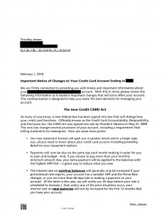
So when I read through this letter I was tickled (not sure if that’s the right word) to find out that part of its purpose was about, yep, fine print.
One of the requirements included in the “Credit Card Accountability, Responsibility, and Disclosure Act,” which was signed into law by President Obama on May 22, 2009, is a redesigning of billing statements.
One of the main changes? Font size. After years of years the fine print, this one looked almost childish with it massive, clumsy 12-pt font!

Although it’s not the language that is used in the legislation, the Obama administration has been promoting a rhetoric of “Plain Language in Plain Site.”
Credit card contract terms will be disclosed in language that consumers can see and understand so they can avoid unnecessary costs and manage their finances … These disclosures will help consumers make informed choices about using the right financial products and managing their own financial needs.
Something like this is very easy to make fun of when touted as “real reform,” but I’m in a generous mood and right now I’m of the persuasion that this is a step in the right direction. For instance, who is really going to take the time to read through something like this and connect the dots:
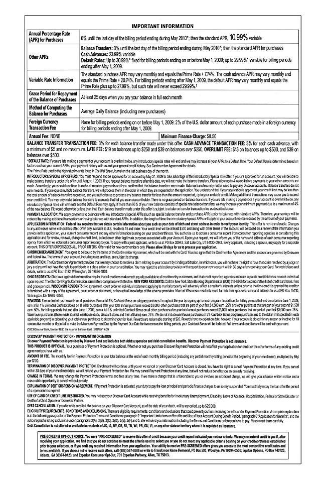
Don’t those call-out boxes, bolded terms, and line-breaks just naturally guide your eye?! They basically interpret the information for you! Unless you’re a fine-print-freak (like moi), this statement probably goes right in the recycling bin. (Which is probably why people are shocked to discovered their rates get jacked every year without them really being aware.)
Right now my class and I are finishing up a project on data visualization, so I’m thinking about how much our credit/debt-lifestyles would change with some powerful graphs that displayed the same information in compelling ways. For example, what if you were given a graph that compared your payment to the amount of time it would take for you to get out of debt? Take data like this …
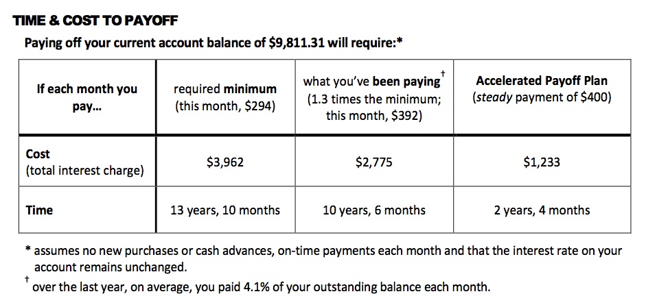
… and render it visually persuasive? What if we had info-graphic specialists that worked in conjunction with consumer protection agencies to present this information in such a way that actually made people cognizant of where their money was going?
Perhaps something like this, but even better?
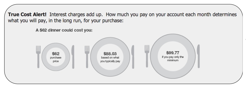
(Dennis Campbell: Center for Plain Language Symposium)
What if we started to radically reimagine the use of info-graphics and data visualization to improve daily practice toward something more sane and sustainable?
- What if every plastic bottle had a visually compelling graphic of how long it would stay in the earth (roughly 5,000 years) compared to how long most people usually use it (less than five minutes)?
- What if every gas station pump had a bar chart that revealed peak-oil information? Perhaps a
 timeline of when oil actually went into mainstream production for automobiles along side a graph that showed how much is left in the earth? Maybe include how long it took to actually make the s**t?
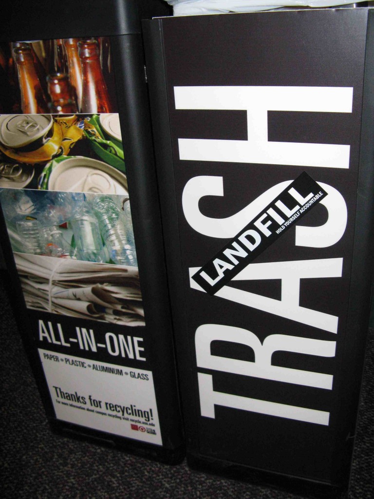
- What if trash bins had graphs that showed the amount of garbage we put in the earth? Maybe even put a mirror next to it so the person could look themselves in the eye before they committed? (Or what if trash cans were renamed to be more accurate: LANDFILL containers?)
- What if the meat you buy at the supermarket came with a stunning graph on the (stunning) amount of water it took to produce it? (Or even oil: it takes 75 gallons of oil to bring a steer to slaughter.)
- What if instead of just the name of the country your shirt was stitched in it actually had a map with the country highlighted? Perhaps put in a dotted line that showed how far it had to travel to be put on your back? Or maybe it could have a mandatory comparison graphic that revealed how much the worker was paid to the cost of the shirt to the profit made through it?
And what if we didn’t wait for anyone else to start doing this? What if we took it upon ourselves to inform others through creative measures? What if we bettered our communities through something as simple as a compelling graphic? What if we worked together to do it?

Hmm. A great article, but the irony of its presentation in hard to read reverse type is pretty thick. I used http://lab.arc90.com/experiments/readability.