The Art of Civility (or, I heart PBS NewsHour)

I don’t actually love the “I heart” expression, but it comes close to my warm, fuzzy feelings of affection for the NewsHour. After going years deliberately, steadfastly refusing to watch television news, I’m now hooked on my nightly PBS fix. (People are beginning to understand that I won’t talk to them between 6 and 7pm est. And the discovery that it’s replayed at 10 on PBS-2 has been a real relief for those days, like Fridays, when I can’t make it.)

Even when it’s depressing, and it often is, it’s reasonable, calm, thoughtful. There are no flashy graphics, tickers, or sound effects. There are no commercials. Gwen and Judy and Kwame and Jeffrey and Margaret and Hari and Ray are smart and sharp but never showy. They are reasonable. Coverage of national and global news–not just the big stories of the day, but actual journalistic inquiry into major issues–acknowledges disagreement without dogmatic bickering; it brings in actual experts in their field to discuss complexities rather than (usually) yell talking points (talk yelling points?) at each other. Even the most argumentative figures (like Newt Gingrich) know that when they come to PBS, the best rhetorical move is to remain calm and try to appear intelligent and nuanced…. reasonable.

It has restored my faith in “the news” in a way that I am daily, sincerely grateful for. It’s definitely made me smarter. I also think it’s made me a better teacher, citizen, and person. Seriously.

So it was a pleasure, today, to have Judy mention commentators Brooks and Shields’ recent award, the inaugural Allegheny College Prize for Civility in Public Life. (The award sounds nice and is also limited: it recognizes the importance of respecting different viewpoints and pursuing reasonable discussion, but it deems “Democrats” and “Republicans” the categories within which public discourse fits. Problematic on a few levels. But still, it’s a good sign. Or a sign that things are so bad…) I enjoy Brooks and Shields and their insights, and I often even forget that one is “right” and the other “left” because they tackle topics with such clear-sightedness. They seem reasonable, and they make differing viewpoints seem reasonable. So it was cool to have that recognized.

And their response was to credit PBS, and the Lehrer and MacNeil NewsHour legacy in particular, for raising the bar of discourse, for setting a standard that they just try to live up to:

But we are the beneficiaries of the standards laid down by Robert MacNeil and Jim Lehrer. I mean, we literally stand on the shoulders of giants. It was they who demanded and insisted upon a standard of civility in dialogue which permeates this whole show and has been the gold standard, in my judgment.

So I’m grateful, but I’m appreciative. We stand as proxies for them.

Some days the news is less depressing.

enculturation: McLuhan at 100

If you haven’t already, I encourage to check out enculturation‘s latest issue: Marshall McLuhan @ 100: Picking Through the Rag and Bone Shop of a Career, launched on the final day of centenary celebrations, 21 years to the day of McLuhan’s death.  Editors David Beard and Kevin Brooks have pulled together quite a stunning issue.

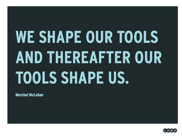
McLuhan quote

image by stefan.erschwendner, flickr

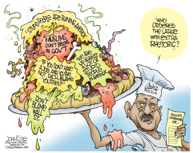
With extra rhetoric, please . . .

Rhetoric in the news:

Herman Cain's Rhetoric Pie

Herman Cain's Rhetoric Pie

It’s true (and perhaps to be expected) that rhetoric is implicitly defined here as bombastic sound-bites, caustic charges thick with generalization, delivered with unexamined confidence. Sadly, we’ve gotten used to having rhetoric framed this way (though we certainly should not accept it). What interests me, though, is the use of “extra” that’s further emphasized with the heaping mess of pizza glob and goop. It points us to a quantitative framing of rhetoric instead of a qualitative one. To stick with the metaphor: rhetoric may be perfectly acceptable as a garnish, a topping to be sprinkled judiciously on something substantive, but if the “toppings” are piled too high and wide we’ll get sick.

It’s a remarkably unproductive way to frame rhetoric that should signal to rhetoricians everywhere that our work is cut out for us . . .

From the Disinformation website comes this post that illustrates the “micro” level of persuasion: two AP stories five decades apart reporting on two similar examples of unanimous parliamentary votes, using two different descriptors to characterize the event…

AP diction

What institutional pressures determine these choices in diction?

Why Beyonce is Perfect for Rhetorical Analysis

My students and I were recently discussing context and how context can impact our analysis of a text, so I, of course, was scouring for the best materials to discuss context in the various ways we can interpret that. This led me to Beyonce. Or, more precisely, Beyonce’s video for “Move Your Body.”

We can, of course, analyze this video independently. Based on the setting of a school cafeteria and population of younger backup dancers, it seems natural to surmise that this video is aimed at the youngun’s of America, for instance. However,  a lot of these elements gain deeper meaning when we place the video in context.

Actually, in the interest of full disclosure, I first saw this video posted on a friend’s facebook and I could see that there was something going on that didn’t conform to all the typical moves of the music video genre. Usually, there would be more time spent on glamorous close-ups of Beyonce, cut-aways to other scenes, or some austere, artsy move (e.g. lighting, quick editing, black and white). So, I went in search of this greater context that must’ve been fueling the decision to approach this video differently. And, yes, there was a reason for all these things.

This video is connected to First Lady Michelle Obama’s “Let’s Move” campaign. No, really. You can see Mrs. Obama herself doing the dougie (and the running man!):

If nothing else, it takes a brave woman to dougie for all of youtube. But, I digress.

This campaign is intended to teach children how to eat healthier and become active so that they grow up creating a healthier America. This is important context for the Beyonce video. “Waving the American flag” actually makes sense now. As does the emphasis on apples, bananas, and other fresh foods that show up in the Beyonce video. And, of course, the campaign is in direct reaction to the increase in child obesity and diabetes that have occurred in recent years. That is a specific surrounding context as well.

Above all else, the long shots of everyone dancing together rather than a video that is cut up so you can only see portions of the choreography is important and related to this campaign. They want us to copy this dance. And they enable us to do that. Not only is the Beyonce video shot so that we, the audience, can see the specific choreography, but there are subsequent videos detailing the choreography steps.

A still shot of the entire dance:

An instruction of the steps:

And, you know what? My students dug it. I dig it. I find this to be one of the most persuasive music videos I’ve seen and I say it’s partially because it’s so connected to this greater context. They’re so focused on the purpose they want to achieve and, because of that, they’re able to appeal to their audience in a creative, yet ingenious way. (Oh, and the fact that she can dance in those heels just blows my mind.)

They know it too:

Beyond the Main Story

So, sometimes we watch things and pay attention only to the important story line and other times we notice what’s going on in the back ground.

This classic Disney cartoon seems innocuous enough:

And then we notice a particular wall-hanging:

father as sausage links

Disney is sort of known for these moves. His films and productions are often picked over to unearth hidden texts and hidden meanings. I find this interesting because, at least in this instance, it’s so very blatant. I wonder if adding these kinds of details work as a way to keep the viewer around. We watch it once and we enjoy it. We watch it again and we start noticing the ominous underbelly. It’s a thought.

data, information, knowledge, wisdom

Thanks, Kate, for the great post on McCandless’s animated visualization.  (Information is Beautiful is also the title of a truly terrific book of visualizations that I highly recommend checking out.)

The use of the word “problem” set me thinking.  If there is a problem, what is it and where is it?  One could argue, I think, that the sheer selection of certain numbers to work with posits an argument of sorts (opting for these categories instead of others suggests their relative importance, in other words).   There’s even a bit of narrative quality to the piece, with the credit crisis debt trumping all others and set in the sequence such that the music dramatically picks up as it’s dropped. So perhaps the piece does have an argument; it’s just not clear-cut.

Which suggests to me that if there is a problem, it does not lay with the piece–but with us.  Our problem is that we are asked to interpret the information and construct an argument of what it’s arguing.  Our interpretation–what does it mean?–is then automatically pitted against other interpretations, which is to say, argument against other arguments.

McCandless actually has another visualization that provokes a similar line of questioning using different terms:

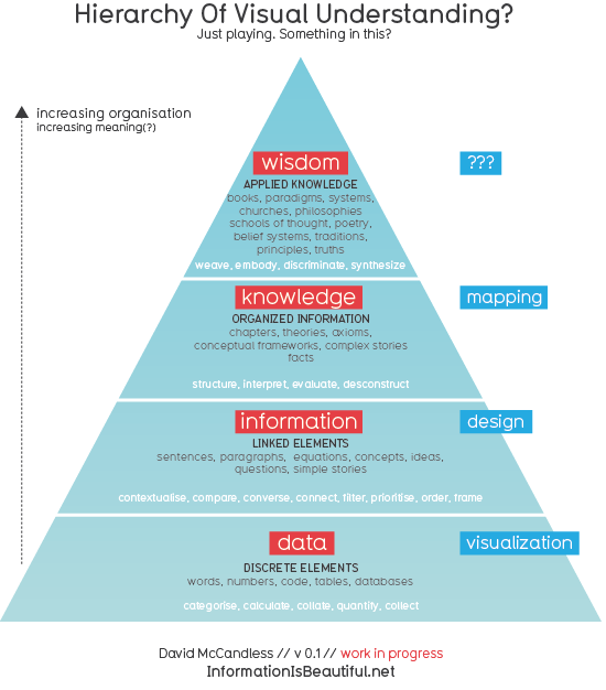
Pyramid of Visual Understanding: Data, Information, Knowledge, Wisdom

Using this vocabulary, the problem we’re presented with is transforming information (the simple story of linked debt-centric elements) to knowledge.  This transforming act is no doubt affected by the natural trajectory towards wisdom (us rhetoricians may think phronesis would fit better here than plain old “wisdom”), which makes the entire interpretative process infinitely more complex–and interesting.

I’d be curious to hear what you think of this chart: its basic assumptions, what might get added, how it might be altered for teaching, etc.  And I’m sure McCandless would, too.  In his posting of this he actually links to a rhetoric blog run by Catherine Schuler, Assistant Professor of English and Professional Writing at East Stroudsburg University, so he’s demonstrated that he’s linked to our community in some fashion.

On a final note, I was intrigued by McCandless’s mention with “Debtris” that we should expect more “motion infographics” in 2011.  Interest in infographics has exploded in the past several years (even though it’s been around for a long time), but the move towards animation and video is taking new routes recently.  Check out this fascinating video by the dynamic Hans Rosling, for example: