the “be stupid” ad campaign by diesel

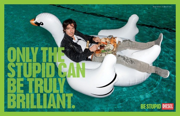
Okay, so my research has, for a long time, focused on issues of intellectualism and anti-intellectualism in American culture.  And yes, that has resulted in a quick eye for all things anti-intellectual in my surroundings.  Still, I can’t be the only one stunned (and frustrated) by the new Diesel ad campaign: “Be Stupid.”  I noticed it first a few weeks back when getting off the D train at West 4th Street in Manhattan.  The long tunnel I had to walk through to surface just a few blocks from the campus of NYU was lined with Diesel’s new “Be Stupid” ads.  Here’s a taste of what I encountered…

Um, moving past the blatant anti-intellectual message that to be cool we should “be stupid,” there’s a whole lot here that’s problematic.   Women as sex objects perhaps?  The preference for balls over brains?  The image of “stupid” (i.e. cool) as a white middle-class youth we may presume has had the privilege of a good education?  Oh, and I just love that these ads (though I’m sure they appear elsewhere) line the subway tunnel right by NYU–one of the most prestigious universities in the country.

Call me “smart,” but I don’ think this ad campaign is as “stupid” (i.e. cool) as it thinks itself to be.

the ethos of 8 pt. font

I just opened a letter from one of my credit card companies and was immediately put on guard: something just seemed different.

Unlike many of my friends (but perhaps not those who consider themselves professional rhetoricians) I’m in the habit of actually reading credit card policy updates and other fine-print heavy documents, like contracts, nutritional notes–you know–“enlarged to show texture”-type stuff.  It certainly isn’t born out of some rigid sense of responsibility; it’s much more of a perverse delight in how much communication is swept under the proverbial rug.  (If you’d like to catch this bug, I suggest you spend sometime at Mouse Print, a site dedicated to exposing the fine-strings-attached in 8 pt. font.)

So when I read through this letter I was tickled (not sure if that’s the right word) to find out that part of its purpose was about, yep, fine print.

One of the requirements included in the “Credit Card Accountability, Responsibility, and Disclosure Act,” which was signed into law by President Obama on May 22, 2009,  is a redesigning of billing statements.

One of the main changes?  Font size.  After years of years the fine print, this one looked almost childish with it massive, clumsy 12-pt font!

Although it’s not the language that is used in the legislation, the Obama administration has been promoting a rhetoric of “Plain Language in Plain Site.”

Credit card contract terms will be disclosed in language that consumers can see and understand so they can avoid unnecessary costs and manage their financesThese disclosures will help consumers make informed choices about using the right financial products and managing their own financial needs.

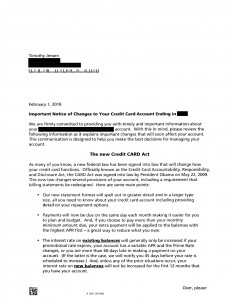
Something like this is very easy to make fun of when touted as “real reform,” but I’m in a generous mood and right now I’m of the persuasion that this is a step in the right direction.  For instance, who is really going to take the time to read through something like this and connect the dots:

Don’t those call-out boxes, bolded terms, and line-breaks just naturally guide your eye?!  They basically interpret the information for you!  Unless you’re a fine-print-freak (like moi), this statement probably goes right in the recycling bin.  (Which is probably why people are shocked to discovered their rates get jacked every year without them really being aware.)

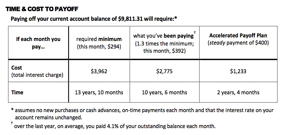
Right now my class and I are finishing up a project on data visualization, so I’m thinking about how much our credit/debt-lifestyles would change with some powerful graphs that displayed the same information in compelling ways.  For example, what if you were given a graph that compared your payment to the amount of time it would take for you to get out of debt?  Take data like this …

… and render it visually persuasive?  What if we had info-graphic specialists that worked in conjunction with consumer protection agencies to present this information in such a way that actually made people cognizant of where their money was going?

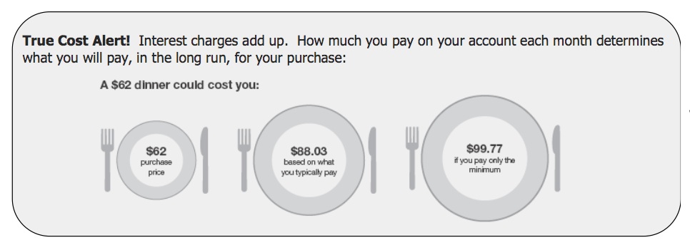
Perhaps something like this, but even better?

(Dennis Campbell: Center for Plain Language Symposium)

What if we started to radically reimagine the use of info-graphics and data visualization to improve daily practice toward something more sane and sustainable?

  • What if every plastic bottle had a visually compelling graphic of how long it would stay in the earth (roughly 5,000 years) compared to how long most people usually use it (less than five minutes)?
  • What if every gas station pump had a bar chart that revealed peak-oil information?  Perhaps a timeline of when oil actually went into mainstream production for automobiles along side a graph that showed how much is left in the earth?  Maybe include how long it took to actually make the s**t?
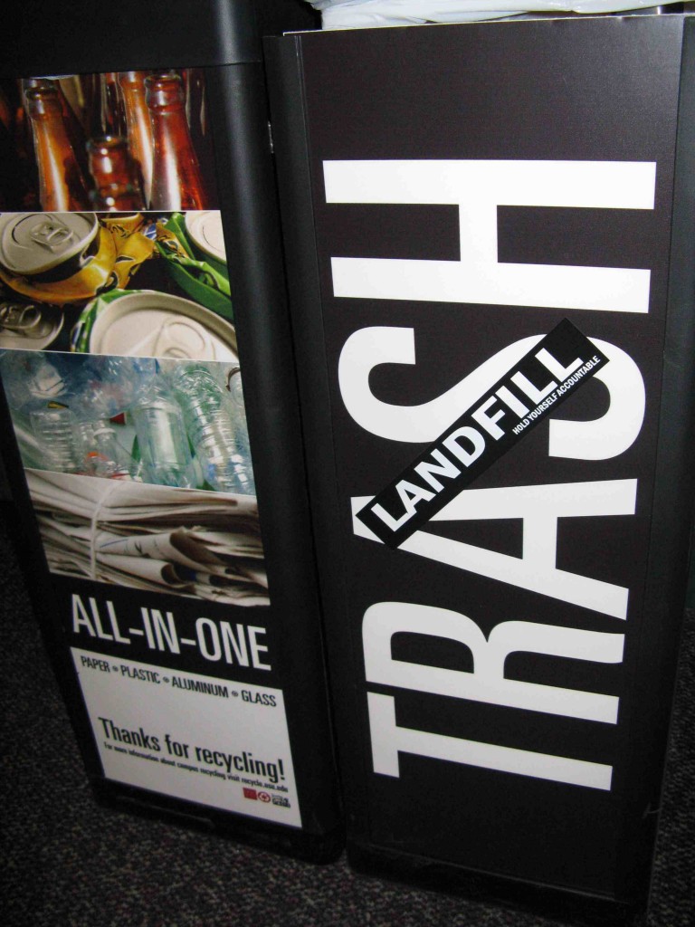
  • What if trash bins had graphs that showed the amount of garbage we put in the earth?  Maybe even put a mirror next to it so the person could look themselves in the eye before they committed?  (Or what if trash cans were renamed to be more accurate: LANDFILL containers?)
  • What if instead of just the name of the country your shirt was stitched in it actually had a map with the country highlighted?  Perhaps put in a dotted line that showed how far it had to travel to be put on your back?  Or maybe it could have a mandatory comparison graphic that revealed how much the worker was paid to the cost of the shirt to the profit made through it?

And what if we didn’t wait for anyone else to start doing this? What if we took it upon ourselves to inform others through creative measures?  What if we bettered our communities through something as simple as a compelling graphic? What if we worked together to do it?

Google’s buzz-kill

Those of you who use gmail no doubt noticed this week’s launch of “Google Buzz,” another social networking project. I clicked in briefly, figured it was just another variation on Facebook, and went back to my emailing.

But it turns out plenty of people reacted much more strongly — and for good reasons. What I didn’t look too closely at was an immense consolidation and public-ization of Google-related activities: “Your Google Reader shared items, Picasa Web public albums, and Google Chat status messages will automatically appear as posts in Buzz.” And I was automatically linked in — “14 people are already following you.” Creeeeepy.

Google’s ready-made network revealed common email/chat contacts, leading to all kinds of privacy breaches. And in this case, the stakes are far higher than the romantic escapades common to Facebookers. In today’s NYT coverage, Miguel Helft points to the difference:

E-mail, it turns out, can hold many secrets, from the names of personal physicians and illicit lovers to the identities of whistle-blowers and antigovernment activists. And Google, so recently a hero to many people for threatening to leave China after hacking attempts against the Gmail accounts of human rights activists, now finds itself being pilloried as a clumsy violator of privacy.

As Evgeny Morozov wrote in a blog post for Foreign Policy, “If I were working for the Iranian or the Chinese government, I would immediately dispatch my Internet geek squads to check on Google Buzz accounts for political activists and see if they have any connections that were previously unknown to the government.”

The key point here, of course, is that despite the publicity trends online, people still think of email as a private realm — and Google ripped down that curtain, leaving people feeling exposed and vulnerable. And they’re pissed.

Google is known for releasing new products before they are fully ready and then improving them over time. But its decision to do so with Buzz, coupled with its introduction to all 176 million Gmail users by default, appears to have backfired.

“It was a terrible mistake,” said Danny Sullivan, a specialist on Google and editor of SearchEngineLand, an industry blog. “I don’t think people expected that Google would show the world who you are connected with. And if there was a way to opt out, it was really easy to miss.”

It seems that Google was just so darn excited — and expecting its users to be same — about the idea of enabling more seamless access and interaction to think much about the consequences… which is just funny, consider how astutely my undergrads note the risks. You’d think the Google team could keep up with our “intro to digital media” conversations.

Supreme Court Justice League!

Oh, my goodness. You must check out this site: http://fantasyscotus.net/

It’s Supreme Court Fantasy League–you know, kinda like fantasy football, but with the supreme court. My favorite thing on that site, would have to be on the rules page. And I quote:

NB. Because this is the inaugural season of FantasySCOTUS.net, the rules may be subject to change.  But as avid followers of the Supreme Court, you should have no problem with rules that are modified frequently.

Ha. It makes me chuckle. It also encourages me that some people care so much about the Supreme Court that they’d make a game out of it. I wonder if students would get into this. It says it’s free for students and teachers. I’m sure it would serve as a good exercise for someone.

via Blogora

the e-reading experience

This past weekend I found myself participating in a lively (and at times heated) discussion about the future of the book and the value of the written word on paper vs. online.  The characters nestled around the table at which the discussion ensued included a professor of medieval literature, a poet/writing teacher, a fiction writer/rare book salesperson, an aspiring writer, and a college composition teacher (myself).

The discussion began when the medieval literature professor said she was troubled by students asking if they could read ebook versions of the assigned texts in her course.  She knew her answer to the students was no, but she said she also knew she had to think more about why that was her immediate answer.  Certainly, she said, it’s important for literature students to read the specific edition she chose (because she chose it for a particular purpose), and certainly students need shared editions so when the class performs a close reading of a particular passage, they are all looking at the same text and can easily find it with the same pagination.  But she knew there was another reason she said no to ebooks and it was more about the value of reading printed texts as opposed to etexts–about the different reading experiences students would have whether they read the text in print or online.

I quickly snapped in points about the cost of books and how ebooks could cut down on students’ expenses (a good thing, I believe) and also the changing nature of our students’ reading experiences and processes.  Many of our students are now growing up reading online and reading etexts, so I tried to argue perhaps students could have valuable reading experiences reading online the same texts we first encountered in a hardbound book.

The medievalist and the poet disagreed, and the poet added that she will not submit her poems to a publication that exists only online.  She doesn’t want her poems read in an electronic version, she said.  She wants them read on paper.

And this got me thinking about Harlot, and about our readers’ reading experiences.  All of us sitting around the table agreed that online publications can contain multi-media texts that can’t be reproduced in print journals, but a few at the table insisted that the same written text printed in an online publication could not possible be read the same way as it could be on paper.  Agreeing that the reading experiences would certainly be different (as of course the reading experience depends on so many factors, not just the form in which it appears), I was a bit concerned by the undertone of a value judgment being attached to those differences.  The woman who works in the rare books department of a well-known book store added to the conversation the issue of how “valuable texts” can only be bought by those with the proper resources, and how hard it is for her to observe people buying rare books solely for the purpose of owning them, rather than for an appreciation of the text itself.

All this is to say that I’d like to participate in and hear more discussion of people’s reading experiences with publications like Harlot. What do our readers gain and lose by experiencing our submissions solely online?


Design Backlash

Consider this a dual author post. Vera posted this comic called “How A Web Design Goes Straight to Hell” on my facebook page. Hilarious and a must-read. Coincidentally, Smashing Magazine’s article posted yesterday was “How To Explain To Clients That They Are Wrong,” which, as Vera put it, “is all about rhetoric.” And, yes, it is. So, per request, I post these things for your enjoyment. (I certainly do enjoy them.)

Judging by Your Markings

I can be a rather skeptical reader — but sometimes more toward readers than authors.

The Shoemaker's Holiday by Thomas Dekker (1599)

The Shoemaker's Holiday by Thomas Dekker (1599)

Yup, the readers. You’re probably wondering how this works considering reading leaves no mark on a book, but sometimes these efforts are, sadly, not so invisible after all. Oh, you know who I’m talking about: those godless creatures who mark up library books! [crackle of thunder here]

I remember the first time I bought a heavily used book for a graduate class. I had taken so long to pick up the play, Thomas Dekker’s 1599 The Shoemaker’s Holiday, that all that was left was a battered copy with more lines highlighted than not. I had the hardest time with that book. I’m usually pretty good (or at least I used to be) at remembering where to find particular passages, but my reputation was seriously damaged with this episode. I could hardly recall where anything was located because I was thrown off by visual markers that, to me, meant nothing and only convoluted how I understood the play. I had no mental pictures of those pages.

It was then that I first began judging these invisible readers by how they mark up a book. After the first few pages, if a reader has highlighted what I think is fairly commonsensical, they get thumbs down, and I proceed through the rest of the book skipping any portions highlighted with that same pen. Or, if a person highlights what I would probably notice and shows herself to be fairly consistent about catching the good stuff, then I’ll come to pay more attention to the brightly yellowed portions of the book.

In recent years, I’ve been making heavy use of online booksellers to get a hold of what I need. When possible, I always buy new books, but if they are excessively expensive I’ll go for a used book and pay good attention to the descriptions booksellers give of their inventory. The only problem is many online booksellers have taken to writing almost no description of the book they’re selling. Instead they offer this kind of uselessness:

Useless comment by online bookseller

And then there are more comical instances like this:

Perhaps considerable markings?

Perhaps considerable?! I don’t know what that means — nor how my purchase benefits world literacy when I’m already quite literate, if I do say so myself — but it makes me think how cool it would be if booksellers could explain whether the markings are smart, uninformed, or some other variety. Not that I’d believe them, though. But it would be amusing.

I already own a copy of the book this last comment is on. I’m no stranger to highlighting, but I only do so when a book is particularly important to my work and when I expect to own that book for a long time to come. I’ve happily highlighted this copy because I expect it’ll remain mine, but it definitely makes me think about the lifecycle of highlighting. The next time I read this book, I’ll be more informed than the first time or the second or the third time through, so I won’t need nearly as many passages highlighted. Funny, isn’t it, how highlighting and leaving notes becomes a record of your intellectual status at the time of your reading?

These days I always highlight for a particular purpose. And it’s possible that neither I nor anyone else will ever match that exact purpose again. With time being a luxury I don’t have these days, I read for particular types of information rather than to piece together the trajectory of a book. It makes me think I’ll be (actually, I probably already am) one of those people who when asked to lend a book quickly shuffles through the pages first to see if there are any stupid comments that might ruin my credibility. Because I, too, will be judged. Alas.
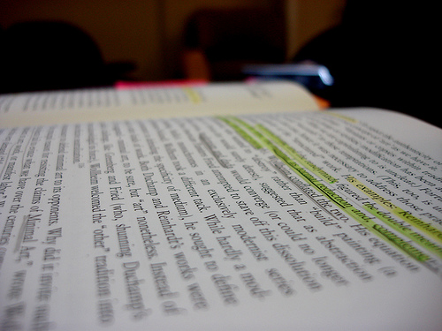
marginalia_book_writing_lecture by hyperscholar (Flickr)

marginalia_book_writing_lecture by hyperscholar (Flickr)

Visual Rhetoric Crush-of-the-Month

The website FlowingData has quite a bit in common with Harlot. Translating complex data of all varieties (money spent, reps at the gym, time you waste) into compelling graphic form, “Data visualization lets non-experts make sense of it all.”  At Harlot, our goal is to reveal all the various and subtle ways rhetoric penetrates our everyday through a language and location that invites everyone to explore and understand persuasion.  FlowingData, meet Harlot; Harlot, meet FlowingData.

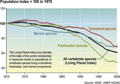
The graphic that’s posted at the very bottom has captured my attention for a number of reasons, mostly related to Derrick Jensen (no direct relation–only in the larger Danish sense), who is perhaps my favorite author (and certainly the most sane person I have ever had the pleasure of meeting).  As a radical environmentalist, Jensen is constantly searching for new ways to communicate just how severe the situation is we are currently, collectively facing.  That’s at the macro level.  At the micro level, he’s challenged with taking statistical data that most logically reveals how the earth is being murdered and transforming it rhetorically into something that sticks.

Some data for you:

living-planet-0207

Facts, though, have a tendency to roll right off of us.  We’re more inclined to be persuaded by stories that connect with us personally, in ways that we can readily link to everyday experience.  Here’s a stellar example of the rhetorical task he encounters when trying to persuade people that our way of life, our sense of self, and relation to what allows us to live is not just unsustainable, it’s immoral and insane.*    And stupid.

“Within our current system, the life span of any particular artifact as waste is usually far longer than its life span as a useful tool.  Let’s say I go to a food court at a mall and eat a meal with a disposable fork.  Let’s say I use the fork for five minutes before one of those tines breaks (as always seems to happen) and I throw it out.  The fork goes in the garbage and is buried in the landfill.  Let’s say this particular type of plastic takes five thousand years to break down … For every minute I used the fork it spends a thousand years as waste: a ratio of one to 526 million, a number so large it’s hardly meaningful to human minds.  On a scale that’s easier to fathom, if we compressed a fork’s five thousand year existence to one year, the fork would have spent only six one-hundreths of a second as an object useful to me.”

Although he presents it rather modestly, Jensen’s shift from a ratio to a story-of-sorts is a crucial rhetorical move–one that all environmentalists and activists of all walks should take note of.  We need to keep pressing for the most effective forms for communicating the gravitas of the situation (but without falling prey to the idea that that’s all that needs to be done).

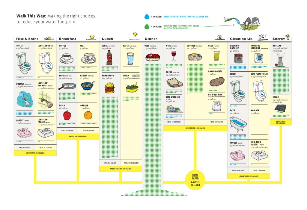
I think the artists of GOOD and Fogelson-Lubliner that collaborated to produce the brilliant illustration below have a solid grasp of what it takes to translate facts in a way that sticks.  I strongly suggest that you click the image to view it in its full glory . . .

trans0309walkthisway

And when you’re done there, don’t forget to check out the archive of amazing at FlowingData.

———————

* I use the term “insane” quite literally, in its strictest definition(s): senseless; an unsoundness of mind that affects one’s capacity for proper responsibility; one whose way of life and/or mental state is such that they are unable to make a sustained commitment to their own health and the relationships that constitute it.  Perhaps “madness” is more accurate, though, since there is a particular violence to our collective insanity.

Terministic Screen

Our attention is naturally directed toward certain things and not others based on our motives; it both receives and refuses information in the meaning-making process, reflecting and deflecting sensory data, as well as models for understanding that data.  Burke’s concept of terministic screens is productive for helping us understand this process.  Concentrate on the awareness tests below and see how you fare–they’re excellent examples for showing students and friends the power of this concept and how it relates to rhetorical analysis.

(Thanks to Kay Halasek for passing these along.)

sesame street meets crime scene investigation

To be honest, I haven’t watched Sesame Street in… well, many many years.  I did, however,  stumble upon these YouTube clips of Sesame Street‘s versions of popular adult crime shows: Law and Order Special Letters Unit and Rhyme Scene Investigation (RSI).  While the videos are–in keeping with SS‘s mission–educational, it’s a little ballsy to connect a children’s educational show to adult crime shows, especially to one that focuses on sexually heinous crimes.  I’m guessing SS just wanted to throw its adult audience a bone.

Law and Order: Special Letters Unit:

RSI: Rhyme Scene Investigation: